Every 2023/24 Premier League home kit reviewed - including Arsenal, Liverpool, Man Utd, and Chelsea

and live on Freeview channel 276
It was the New York Times’ legendary street photographer Bill Cunningham who said that fashion is the armour to survive the reality of everyday life. In the case of the Premier League’s 20 participating clubs, it is also the chain mail that aids them in their bid to endure another campaign of top flight competition.
Some football shirts are better than others, that is just a fact of life. But exactly what makes for a good kit can be a tricky, intangible thing to pin down. Is it a matter of aesthetic, or spirit? Is it a quantifiable metric, or a haphazard gut feeling?
Advertisement
Hide AdAdvertisement
Hide AdQuite honestly, I don’t know, but I do know that I have been asked to review all 20 of this season’s brand new Premier League home shirts, and thus, channelling my inner Miranda Priestly, I intend to do precisely that. So, without further ado...
Arsenal


A kit that screams ‘front of house in a Chinese takeaway’ with its full-blooded reds and flashes of golden trim. Not a bad effort from Adidas, but by no means the best they have bestowed on the Gunners in recent seasons. At least supporters can rest easy in the knowledge that even if they don’t like this shirt, there will be some special edition training kit or other based loosely on something absured like the intricate patterns of a bus seat released next month to salve their disappointment.
Aston Villa
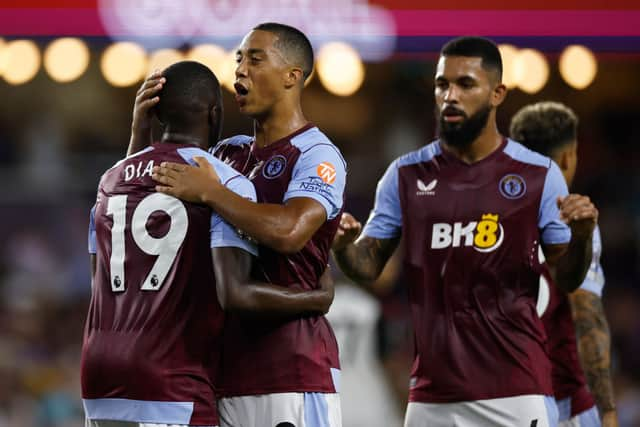
I’m sorry, but this is a Burnley shirt, and not a particularly nice Burnley shirt at that. Castore are skating on thin ice as far as my affections are concerned, and this lacklustre effort has done little to endear them. In fairness, matters aren’t helped by that godawful sponsor, which seems to postulate that the number 8 is the king of all the single digits. At best, 8 is a lesser duke.
Bournemouth
Nothing wrong with this at all. It’s black, it’s red, it’s striped - directness incarnate. Extra marks for the little button up collar, which harks back to a simpler time when everybody bought their t-shirts from Topman. Had it a picture of Loud-era Rihanna on the front, we’d really be cooking on gas.
Advertisement
Hide AdAdvertisement
Hide AdBrentford
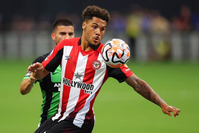
Four kits in and we’ve had three betting sponsorships. This one is made especially galling given that Ivan Toney will have to sport it when he returns from his ban for gambling-related offences later in the season. The sooner the Premier League get rid of them, the better. As for the shirt itself, it’s a fine enough affair, and the kind that you imagine will only get better with age. The black detailing grounds it all nicely.
Brighton
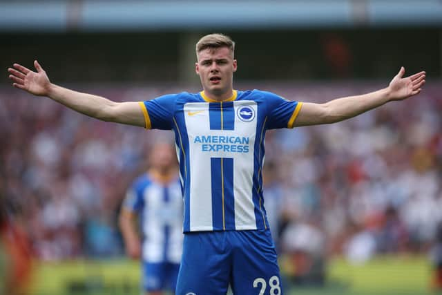
Nike are getting away with murder. This is just a variation on a template that they have rolled for about 400 different teams this summer, albeit with some appealing touches. It’s a decent enough shirt, don’t get me wrong, but a little bit of individuality wouldn’t hurt, surely.
Burnley
I’m sorry, but this is just a West Ham shirt. It’s like the Premier League’s claret and blue cohort chucked their car keys in a bowl just to spice things up, and have all subsequently emerged with something slightly askew. There is a touch of the uncanny valley about it, but it does have to be said that this is a lovely kit. The collar, the sleeve trim - oh it’s a corker! Again though, that sponsor. Imagine this bad lad with the Classic Football Shirts emblem from last term; we could have been entering all-timer territory. Still though, a noble effort, well befitting of a top flight return.
Chelsea
A kit so bad, it should be deemed a war crime. Everything about this shirt looks cheap and nasty, from the vast expanse of uninterrupted blue, to the holographic badge that looks like it was made in a Polly Pocket sticker maker that your little sister might have had as a child. Perhaps Chelsea will have a sponsor by the time the season rolls around, but at the present moment, that barren torso brings to mind being stranded on a raft in the middle of an endless ocean. Your lips are cracked and broken from the beating sun and the whip of a salty wind, no help is coming, and you are days away from starving into obscurity. Death would be a relief. The whole thing smacks of an unlicenced imitation that Pro Evo would have to cook up for West London Blues in the absence of an official partnership. Really, really poor.
Advertisement
Hide AdAdvertisement
Hide AdCrystal Palace
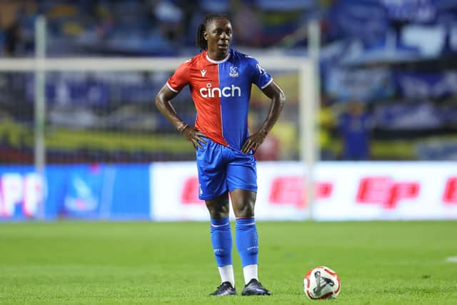
Crystal Palace have come through with a kit that looks like the garb of a medieval jester with a sideline in horse jockeying. There’s nothing profoundly offensive about it, per se, but it’s not a patch on last season’s striped beauty. Bonus points for a sponsor fronted by national treasure Rylan, though.
Everton
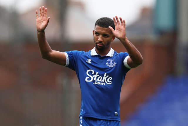
Pretty smart, Everton. Pretty smart. A kit that harks back to the glories of yesteryear while still retaining a fresh, modern feel. I like this one. I like it a lot. My only fear is that should Everton finally succumb to the quicksand pull of relegation, it could be marred forever by a cavalcade of harrowing memories. And that’s coming from experience; I support Sunderland.
Fulham
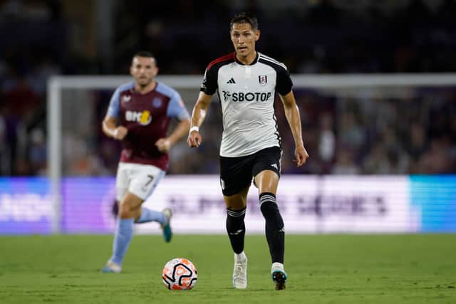
Fulham have smashed it out of the park with this one. Bold blacks, crisp whites, touches of red - it’s like a uniform worn by the henchman of a bagder-themed Batman villain. Another effort that I could see ageing like a dream in years to come. Hard cut to 2048, and this will be the toast of the Cottage.
Liverpool
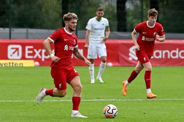
I am a simple man. I like Yorkshire Tea and original Pot Noodles, the comforting embrace of freshly-laundered bedsheets and that little buzz you get from winning a game of Connect Four. I also like this Liverpool kit. Quite a bit, in fact. Round neck, wonderful deep shade of red, minimalist trim; it’s a stunner. Sometimes less is more.
Advertisement
Hide AdAdvertisement
Hide AdLuton Town
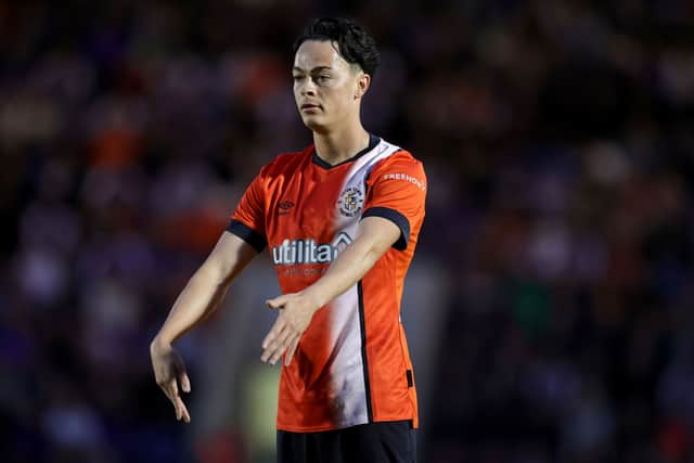
Fair play to Luton; first time they’ve been back in the top flight in an age, and they’ve rocked up wearing the most EFL kit of all time. Not sure if it’s the hi-vis orange, the white sash, or the energy company sponsor, but this has ‘2011/12 League One promotion play-off winners’ written all over it.
Manchester City
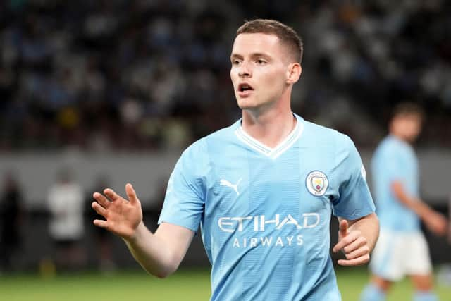
There is a fine, fine line between calm and boring. Which side of that particular divide does Manchester City’s home shirt fall on? That’s a matter of personal preference, but I will say this; I have been more greatly moved by sinks of dishwater.
Manchester United
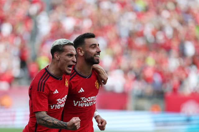
Despite the commonly-held misconception, you cannot see The Great Wall of China from space. You can, however, see the sponsor on the front of Manchester United’s home shirt. It is, in a word, ludicrous. Presumably it has its own postcode. Were Succession’s Tom Wambsgans to see it, he would be sent into a meltdown of the most vindictively verbose proportions. It’s a shame too, because otherwise, this is a pretty decent effort from Adidas.
Newcastle United
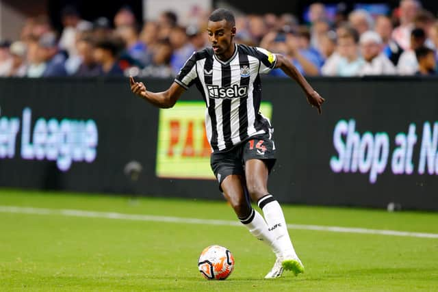
Castore could have released a range of black and white striped bin liners this summer, and Newcastle United fans would have lapped it up, so long as it still had a Champions League badge on the sleeve. As it happens, they do have an actual shirt, and it’s a perfectly passable one. The Toon Army have had far, far worse.
Advertisement
Hide AdAdvertisement
Hide AdNottingham Forest
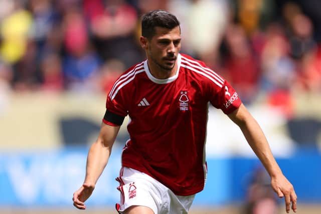
My theory here, conspiratorial as it may be, is that Adidas had a truckload of surplus rejected Aberdeen kits from any given season over the past few years, whacked a tree on the chest, and just sort of ran with it. I’m not complaining, mind you. I think this is a gem, pure and simple.
Sheffield United
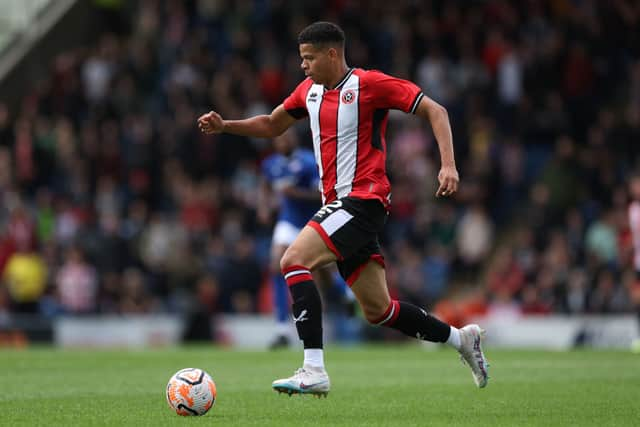
I can confirm that this is indeed a Sheffield United shirt. Beyond that, I have nothing revelatory to say.
Tottenham Hotspur
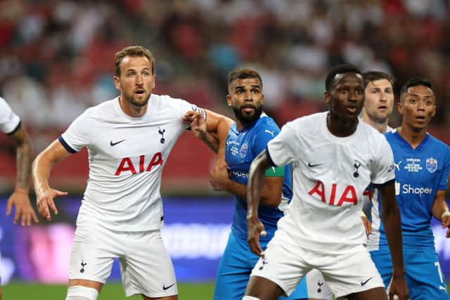
You can’t fool me, Tottenham. This is the exact same shirt that you wore last season. And indeed the season before that. The jig is up, the long con has been uncovered. Then again, how many times can you reinvent a plain white t-shirt? Somebody at Nike has clearly hit their ceiling.
West Ham
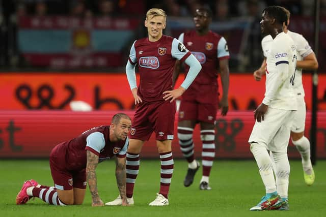
I’m sorry, but this is an Aston Villa kit. Not to labour a point, but the trinity is fulfilled. The great migration of claret and blue is complete, and West Ham are neither the winners or the losers, but a secret, bang average third thing. The only interesting detail to this shirt is the hint of a bubble watermark that runs through it, and even then, more than anything else, that brings to mind the last traces of a hijacked shopping trolley as it slips beneath the murky surface of a park pond.
Advertisement
Hide AdAdvertisement
Hide AdWolves
Wolves continue their fine tradition of dressing like the Toffee Pennies from a tin of Quality Street, and to be fair, this is a quality kit. I’m a big enough person to acknowledge my foes’ successes, and Castore, this is one is alright by me.
Comment Guidelines
National World encourages reader discussion on our stories. User feedback, insights and back-and-forth exchanges add a rich layer of context to reporting. Please review our Community Guidelines before commenting.