Every 2023/24 Premier League away and third kit rated - including Everton and Burnley shockers

and live on Freeview channel 276
In an age when every football hipster has a collection of vintage Serie A shirts to call their own, kit manufacturers have every reason to up their game, knowing that a particularly gorgeous effort will be flying off the shelves for years to come. All of which makes it something of a shame that this year’s collection of home kits – which my colleague Jason Jones has already picked over – is a bit… well… bland.
Is anyone going to be wearing a 2023/24 West Ham home kit 20 years from now? No. They’ll stick to the old Julian Dicks-approved shoulder stripes from the Nineties, and rightly so. But there’s still the away kits, the third kits, the special-edition change strips that Arsenal churn out every other week – and this is the space for innovation and wild ideas, a design space where anything goes. So what did the kit manufacturers of the world come up with, and who will be cutting the biggest dash on their travels in the coming campaign? Let’s take a look at all of the Premier League change kits revealed so far...
Arsenal
Away Kit
Advertisement
Hide AdAdvertisement
Hide Ad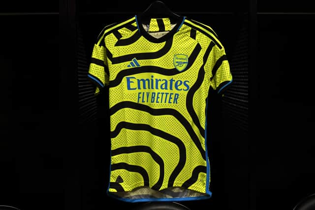

Presumably created after a designer spent an evening studying contour lines on an Ordnance Survey map while tripping heartily on magic mushrooms, this is a unique medley of road safety-conscious high-vis and retina-searing psychedelia. To be fair to whoever came up with this, the return to fashion of the bucket hat does also suggest the return to fashion of acid house clobber more broadly, and this wouldn’t have been out of place at the Haçienda. For those of us who prefer our heads unadorned and are too old for all that rave stuff, however, it’s fairly hard to look at.
Aston Villa
Away Kit
A classy cream effort rather spoiled by the incongrous clash between the top and the claret and blue shorts. The little flash of pale blue on the neckline doesn’t work either. This is what happens when someone presents a good idea to the boardroom and everyone else has to add their own idea. If the blue was exorcised, it would be a strong four stars. As is... it just doesn’t work.
Bournemouth
Away Kit

What in the gibbering wreck of society is this? Let’s start with the pale, gray-blue colour straight from the more untroubled regions of the Dulux paint chart, which is horrible, and swiftly move onto what I can only assume was a collaboration with the local police based on asking local ne’er-do-wells to provide their fingerprints for both future investigations and a football shirt. Appropriately enough, this kit is criminal.
Brentford
Away Kit

No change from last year for the Bees, for which the club deserve immense credit. That they aren’t willing to gouge their fans for every last penny almost makes us forgive the sheer blandness of a kit whose colour falls somewhere between wilted mint green and toothpaste blue.
Third Kit
Advertisement
Hide AdAdvertisement
Hide AdHelpfully modelled by what is either a hot new boyband or a collection of contestants who have been booted out of Love Island, this kit and its accompanying launch video spits in the face of the very concept of epilepsy. Despite the likelihood of seizures in the stands, I quite like it. It’s certainly lively.
Brighton & Hove Albion
Away Kit

Whether the nod to coach Roberto Di Zerbi’s days in charge of Sassuolo was intentional or not, this is a really rather spiffing effort, which is just a set of black shorts and perhaps a slightly darker shade of green away from the top tier of this year’s change strips. The collar and sleeve trim are a lovely touch. Not a classic, but Brighton has more than enough hipsters to ensure that some middle aged men will be sat sipping IPA in this number in a decade or so.
Burnley
Away Kit

I should begin this review by confessing my bias - I am a Blackburn Rovers fan, and am as such conditioned to vomit at the very sight of all Burnley kits. That being said, I would be feeling pretty queasy regardless of who I supported right now - this is a stone cold stinker. “Sickly yellow offset with a thick brown streak” is unlikely to be top of any fashionista’s wishlist, and the weird fizzy effect down the sides of the stripe simply make everything even worse. Heinous.
Chelsea
Given that Chelsea haven’t even found a shirt sponsor yet, it is perhaps unsurprising that they haven’t gotten round to releasing any of their change kits. You can however, go to their online store and buy from their club-branded Hawaiian shirt range, and whatever their away day clobber looks like, it definitely can’t be any worse than that.
Crystal Palace
Away Kit
Advertisement
Hide AdAdvertisement
Hide Ad
Crystal Palace have quietly churned out quite a few of the very best kits of the last few years, and their latest change kit is another absolute humdinger. It looks like an ode to a forgotten Argentinian team of the Eighties. The blue is perfect, the collar gorgeous. Genuinely, no notes. I adore it. Give the ladies and gentlemen of Macron a round of applause and a pay rise.
Everton
Away Kit

Everton, meanwhile, have a lengthy recent streak of absolutely execrable efforts - and there is no uptick in quality this year. Did anyone want a throwback to their salmon pink kit? Did anyone want to add some dodgy dark blue stripes? Does the concept of quality control exist on Merseyside? The only genuine challenger to Burnley’s dreadful change strip this year, and possibly even worse than Everton’s goalscoring record. No wonder they’re struggling to sign a striker - most fashion-conscious forwards wouldn’t want to be seen dead in this.
Fulham
Another club who haven’t yet bothered to release a change strip this summer, but based on previous years we suspect there is a very high chance that it will be rather boring. Nothing against Fulham, you understand, but “lovely ground, dreary kits, insane matchday pricing” is basically their unofficial motto at this point.
Liverpool
Away Kit
This is a cautionary tale about getting too clever with throwbacks. An homage to the classic green and white quarters of the mid-Nineties - probably Liverpool’s loveliest kit - but with too much jazziness chucked in, too much of a desperate desire to be modern and relevant. It’s like reprinting the complete works of Shakespeare with swear words and phrases borrowed from the Urban Dictionary, or re-releasing a Beatles song with a guest rap from Pitbull in the middle eight.
Luton Town
Away Kit
Advertisement
Hide AdAdvertisement
Hide AdAs a man who abhors hard work and does everything possible to mooch through life at minimum effort, I have nothing but respect for Umbro’s design team here, who have simply taken the half-decent home kit, flipped the colours, and popped down to the pub for an early pint. Look, it was Friday, nobody had any energy left. We’ve all been there.
Manchester City
Third Kit

No away kit as yet from the reigning champions, but we do have their third strip - and for some obscure reason it’s modelled on the background of all Eighties horror movie posters. I presume the presentation video included some unconvincing thunderstorm sounds and some flashing blue lights. A bit budget, to be honest.
Manchester United
Away Kit

Apparently the Glazers are so desperate to cut costs these days that they’ve stooped to using rejected Fluminense kit designs - in this case, one that was rejected for being too close to your uncle’s awful study wallpaper that hasn’t been changed since the Seventies. Not truly horrible, but still the sort of kit that Sir Alex Ferguson would blame for a mildly embarrassing away defeat.
Newcastle United
Away Kit
Look, you’ve probably already decided whether or not you care about the geopolitics of this kit, and the fact that Newcastle will be turning out in what may as well be a Saudi Arabian flag for the second year in a row. I haven’t the energy to try and convince anyone to change their current opinions on the matter. Suffice to say that, purely from a design perspective, it’s quite nice and the black and white trim works very well, as does the detailing. On the other hand, you won’t actually be able to see the players on the more verdant Premier League pitches. A combination of sportswashing and effective camouflage.
Third Kit
Advertisement
Hide AdAdvertisement
Hide AdThis we can get behind without political reservations. The chevrons are just the right amount of unsubtle, the sharp yellow trim is lovely and sets it off beautifully. Not a stone cold classic, perhaps, and not the most eye-catching at first glance, but simply very nice. Good job, Castore.
Nottingham Forest
Away Kit
This is one of those kits that suffers from two problems - firstly, that Crystal Palace did a similar thing much more elegantly, and secondly that it just has that slightly cheap, template training top look. It’s not bad, by any means, but just feels a bit... undercooked.
Third Kit
A shirt which seems to be the byproduct of excessive ayahuasca consumption. There seems to be about fifty different ideas all vying for space on the same shirt, with a top half that looks like a discarded Magic Eye painting and a bottom half which... god knows what it does, to be honest. A hot mess but sufficiently brazen and unique that it will be beloved by some people, albeit mostly by people with visual impairments.
Sheffield United
Third Kit

Easily the laziest and blandest shirt among this year’s offerings. It’s just pale grey, done. The words I’ve written on this shirt so far already represent more love and effort than went into the entire design process.
Advertisement
Hide AdAdvertisement
Hide AdTottenham Hotspur
What is it with London clubs and not being bothered to release change strips? Is there some kind of Brexit-related supply chain issue between Nike and north London? Did the shirts get impeached as well? Who knows, but we still don’t know what Spurs will wear away from home this year. Based on recent efforts, probably something hideous involving too much purple.
West Ham United
Away Kit

Inspired by a incredible two-for-one deal on Hospital White clothing dye, West Ham have gone very monochrome indeed this year, even opting for the rare ‘whiteout’ badge to fool opposing players into forgetting which team they’re up against. The kit likely to induce the most squinting of any released this year. Dragged up towards acceptability by the collar and sleeve trim.
Wolverhampton Wanderers
Away Kit
Based on a Baldrickian cunning plan to convince opponents they’re playing Spain, but probably mistimed given how bad the Spanish national side are these days. Nevertheless, it’s a pretty nice effort, although the black/dark green shoulder pads might be a touch too bulky to enter design heaven, and could end up looking rather Portuguese in the wrong light. Which, much like Newcastle’s Saudi leanings, probably wouldn’t be accidental anyway.
We want your feedback on 3 Added Minutes - details here
Comment Guidelines
National World encourages reader discussion on our stories. User feedback, insights and back-and-forth exchanges add a rich layer of context to reporting. Please review our Community Guidelines before commenting.